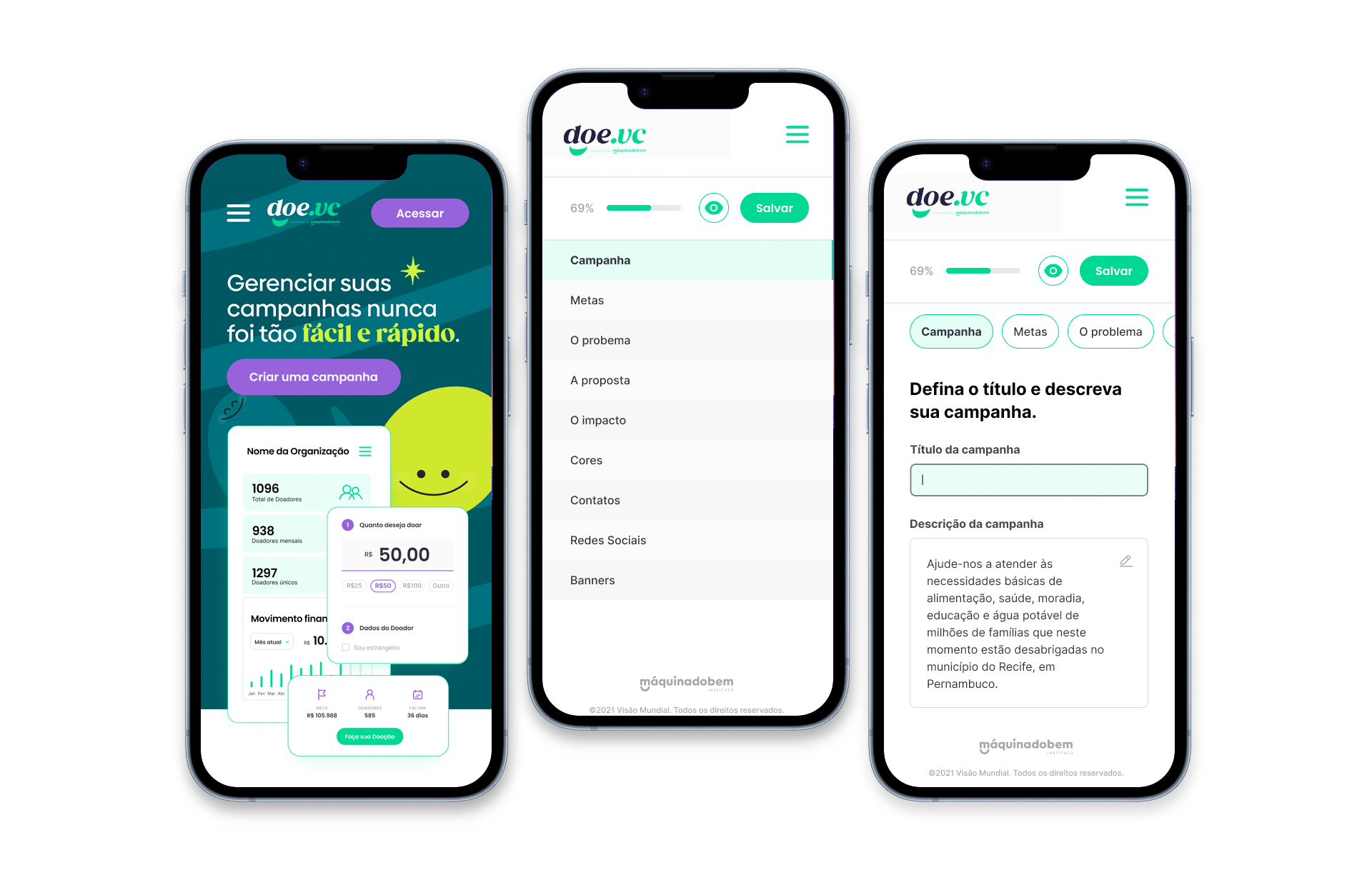
DoeVc donation platform
The product allows organizations to create simple and manageable campaigns and for donors to make their donations quickly and securely.
Tools used: • Miro • Figma • Photoshop • Illustrator
Context
DoeVc is a SaaS donation platform built to simplify the way organizations campaign, solicit and receive donations for their causes.
The purpose of the platform is to help Civil Society Organizations of any size, churches and companies with their own social projects to enhance their campaigns, scaling their reach to obtain a greater amount of donations.
To achieve its goals, DoeVc needed to stand out from its competitors, some of which were already established in the market, offering a superior user experience that was easy to reach and, at the same time, offering customization according to the branding of each organization.
Keywords for UX design and technology requirements:
- Fast and friendly experience;
- Multiple payment options;
- Data security and protection;
- Integration with social networks;
- Fast and secure checkout.
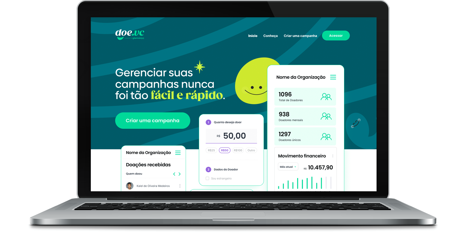
The challenge
Develop a digital fundraising platform that offers ease of use, zero bureaucracy and a remarkable experience.
Desk Research
To guide us towards the challenge of offering a tool that is superior to what the market already has available, we studied the main competitors, identifying gaps that we could solve or overcome in terms of technology quality and user experience. The main competitors studied were:
- Donate [B2B]
- Trackmob [B2B]
- Improvement [B2C]
- Catharsis [B2C]
- Kicking [B2C]
We discovered at least three important data for the product:
- The donation market moves US$ 65 billion in the world economy annually;
- The annual growth of solutions in the sector is around 20% per year;
- In Brazil, there are about 80 donation platforms or similar, however, few with minimally adequate technology and user experience design.
Some of the research sources:
Opportunities
We list the business opportunities to be contemplated by the product, based on desk research and business strategy, which guided the competitive advantage to be taken advantage of immediately in the MVP (Minimum Viable Product) phase.
We, therefore, decided to build the following functionalities as a priority:
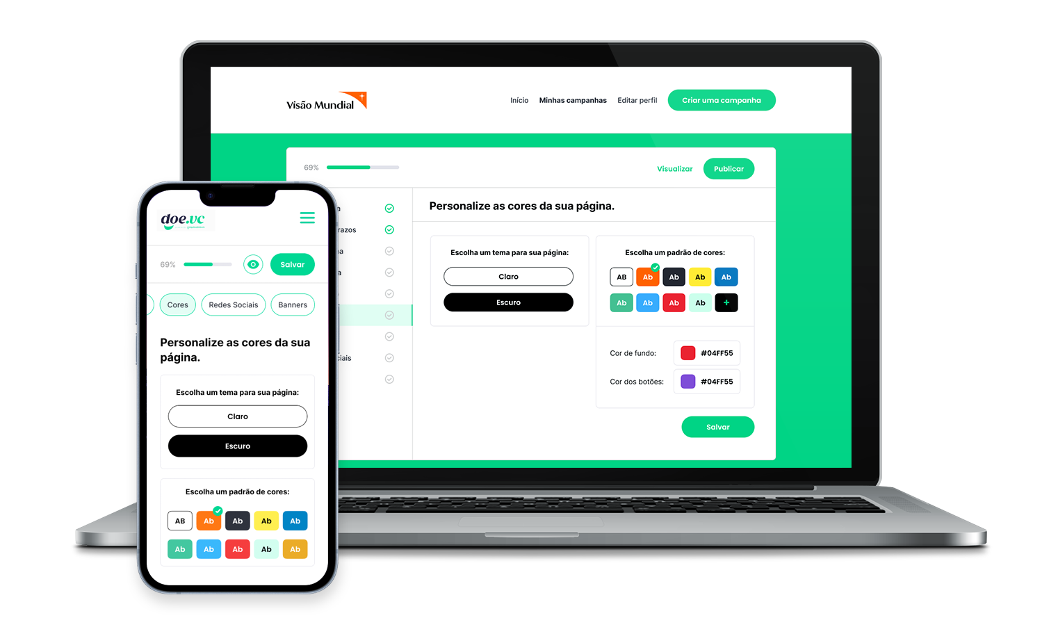
- Customizable Platforms and Donation Pages
- Donation landing pages
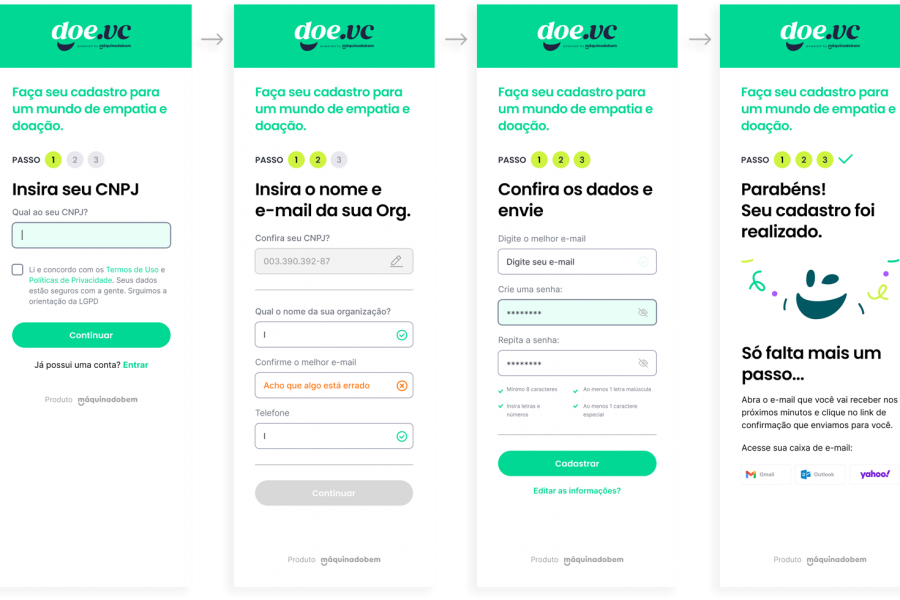
- organization registration
- Simple and fast checkout
- Portal with exclusive dashboard for the donor
- Dashboard for organization
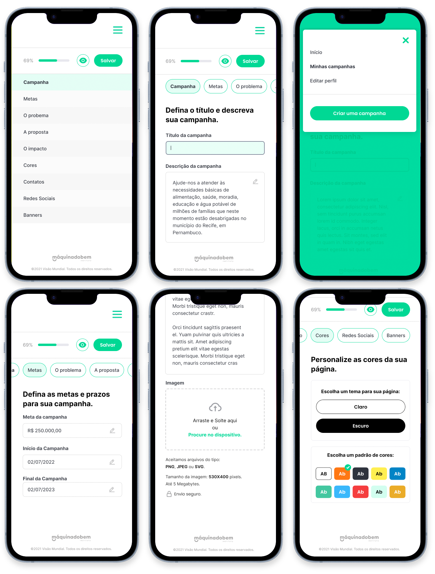
- Campaign editor
- And the platform website
Pains
We did a competitive analysis based on research among the main competitors and listed the pains that we could solve with the product:
- Bureaucracy in the registration of the organization
- Lack of digital security in available tools
- Absence of data and reports for analysis of donations.
- High service maintenance fees
- Lack of usability and experience in handling the platform
- Delay in the rowing of the value that has fallen and becomes available for withdrawal.
Branding guidelines


Website
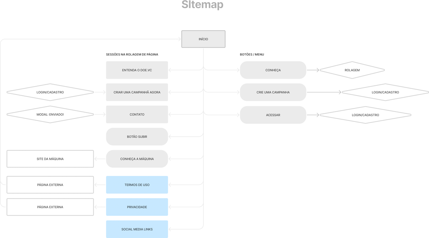
Donator journey

Donator portal

Organizing the subscription
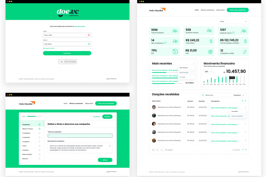
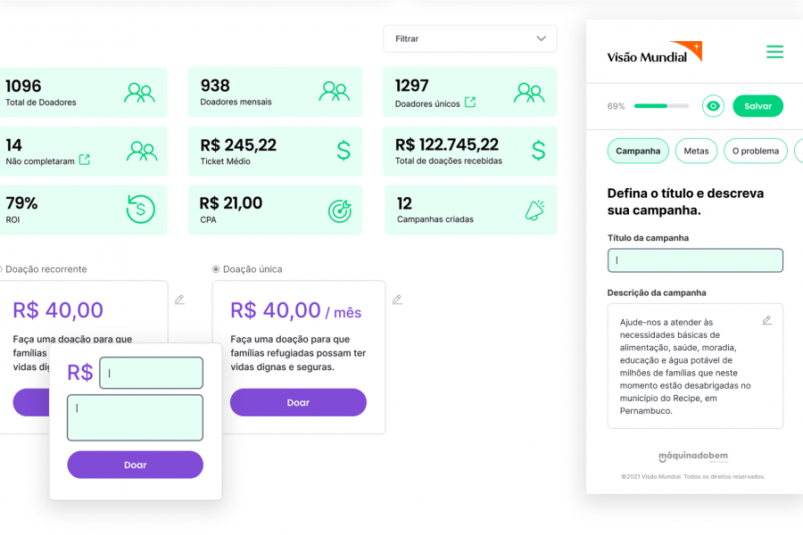
Dashboard

Campaign editor
Lessons learned
Personally, I learned a number of career and life lessons from collaborating on this product.
To begin with, being part of the creation of a tool that will contribute to social causes, most of them without government support, is exciting.
From a function point of view, as it was my first opportunity as a Product Designer, I could see more clearly the business requirements impacting design decisions, sometimes slowing down the design process, other times accelerating it.
Working side by side with a lean team of Devs, and an engaged tech lead on the product was especially rewarding. Day-to-day design challenges (taking into account that I was the only designer on the team) and deliveries to the tech team were greatly facilitated by the good relationship with this group.
Suggestions for future improvements
In new phases of product maturity, some features could be implemented, in order to increase engagement, for example, with gamefication that motivate an increase in donations.